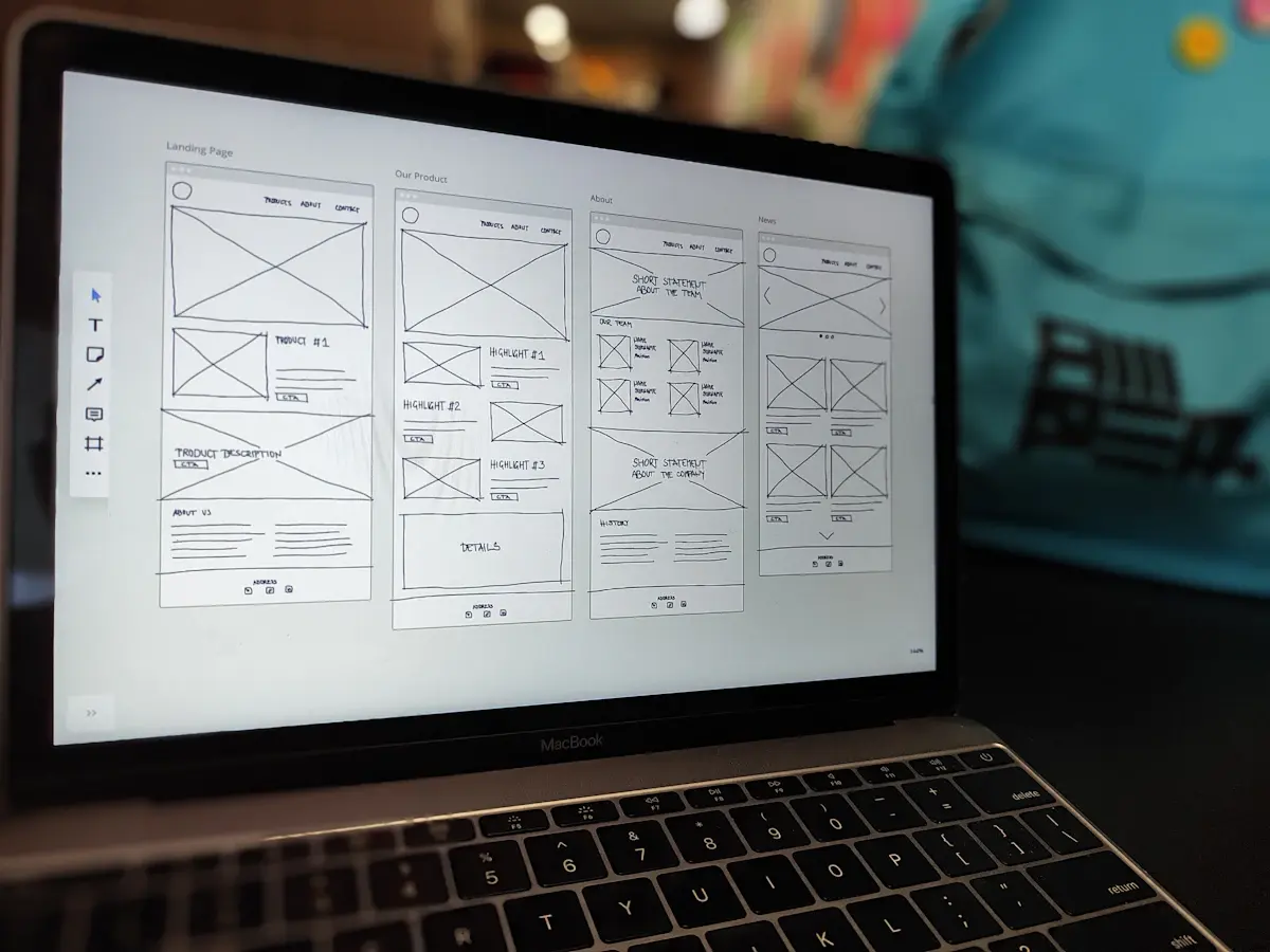
At some point early in a web project, your designer will send you something that looks unfinished. Grey boxes, crossed rectangles where photos will go, a few lines of placeholder text. That is a website wireframe, and it’s one of the most useful documents you’ll see in the whole project.
It’s also the one most business owners skim. It doesn’t look like a website yet, so it’s tempting to say “looks fine” and wait for the real design. That’s a mistake, because the wireframe is where the big decisions get made.
What a website wireframe actually shows
A website wireframe is a plan of a page with the styling stripped out. No colours, no fonts, no photography. What’s left is the structure:
- What’s on the page: every section, in order, from the top to the footer.
- What matters most: which message gets the top spot, which gets a small box further down.
- Where people can act: buttons, forms, phone numbers and links to other pages.
- How pages connect: the menu, and where each call to action leads.
Think of it as the floor plan of a house. You wouldn’t choose the wallpaper before agreeing where the kitchen goes, and you wouldn’t want to move the kitchen once the tiles are down.
Why it comes before the design
Stripping out the styling is deliberate. When people look at a finished design, they react to the colour and the photos first. A conversation about whether the page says the right things turns into a conversation about a shade of blue.
A wireframe forces the right argument at the right time. Is the enquiry form too far down? Does the homepage explain what you do before it asks for anything? Is there a section nobody will read? Those questions are easy to answer when there’s nothing pretty to distract you.
It’s also about cost. Moving a section in a wireframe takes minutes. Moving it after the design is approved takes longer. Moving it after the page has been built, tested on mobile and filled with content takes longer still, and it’s usually where budgets start to creep.
The wireframe is the cheapest point in the project to change your mind. Use it.
What to check before you sign it off
You don’t need a design background to review a website wireframe well. Work through these questions for each page:
- Could a stranger tell what you do from the first screen? Read only the top section. If it’s vague, say so now.
- Is the main action obvious? There should be one thing you most want visitors to do, and it should appear early and more than once.
- Is the order right? A good page answers questions in the order people ask them: what is this, is it for me, can I trust you, what does it cost or involve, how do I start.
- Is anything missing? Accreditations, service areas, opening hours, delivery details. Things you take for granted are easy to forget.
- Is anything there only because you like it? If a section doesn’t help a customer decide, it’s a candidate for cutting.
- Does the mobile version make sense? Ask to see how the sections stack on a phone. Most of your visitors will probably see that version.
What to ignore
Some things in a wireframe are placeholders, and commenting on them wastes a round of feedback. Don’t worry about the grey colour scheme, the font, or the exact wording unless real copy has been dropped in. The boxes with crosses through them are simply marking where an image will sit.
Do pay attention to how much text each area allows for. If a box has room for two lines and you know that service needs two paragraphs, flag it. Content that doesn’t fit the layout is one of the most common reasons a finished site looks worse than the design did.
How to give useful feedback
Collect comments from everyone who has a say and send them once, in one document. Drip-fed feedback from four people is how projects stall. Where two colleagues disagree, settle it before it reaches the designer.
Explain the problem instead of prescribing the fix. “People always ring to ask if we cover the Wirral, and I can’t see that anywhere” is more useful than “add a map here”. Your designer may have a better way of solving it.
Then sign the website wireframe off properly, in writing. Sign off means the structure is agreed and later changes to it are changes to the scope. That protects you as much as the agency, because it makes everyone take this stage seriously.
Where this fits in a project with us
Every site we build starts with structure before style, whether it’s a new build through our website design and development service or a rethink of an existing site through website redesigns. If your current site was built without that step and it shows, that’s usually the first thing we put right.