A lot of small businesses have a logo and assume that’s their brand identity sorted. Then they look at their website, their brochure and their social posts side by side and wonder why nothing looks like it came from the same company.
The logo is usually the smallest part of what people see. A flyer might have the logo in one corner and the rest of the page filled with colour, text and pictures. If those aren’t governed by any rules, each piece ends up looking like whoever made it that week.
A brand identity system is the set of building blocks, and the rules for using them, that make everything look and feel like one business. Here’s what it covers and why each part earns its place.
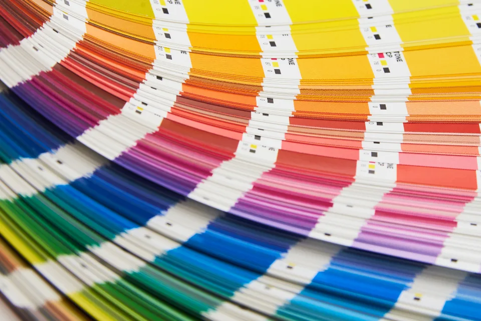
Colour: more than one blue
Most businesses have a main brand colour. Very few have a proper palette, which is where problems start.
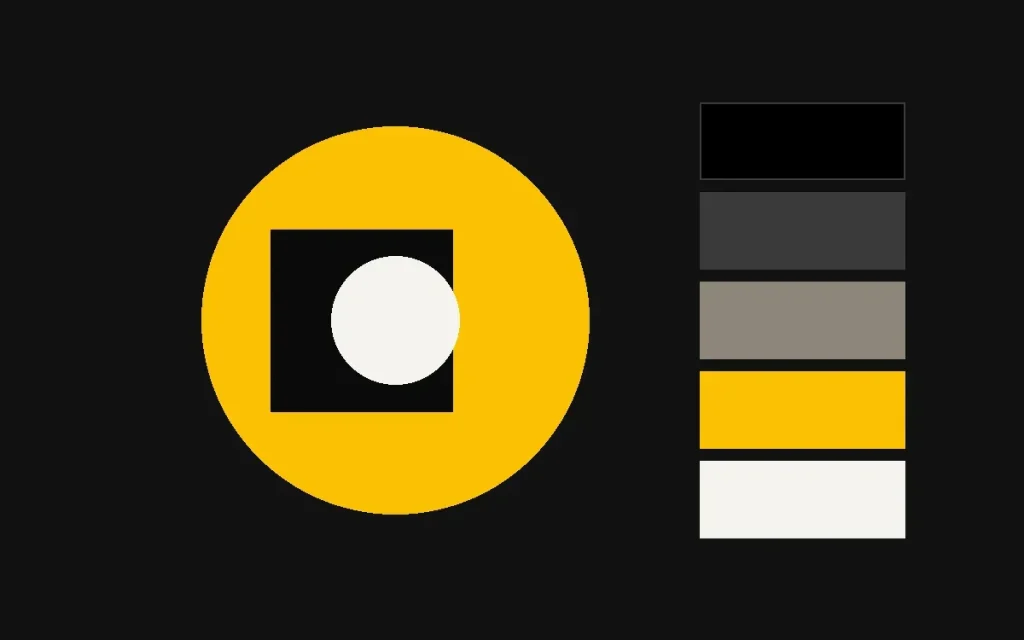
A usable colour system normally includes:
- Primary colours, one or two that people should associate with you
- Secondary or accent colours for highlights, buttons, charts and variety
- Neutrals: the greys, off-whites and darks used for text and backgrounds, which actually make up most of what people see
- Proportions: guidance on how much of each to use. A brand that’s mostly white with a sharp accent looks very different from one that floods everything in its main colour.
Check colour combinations for contrast too. Text that’s hard to read on a background is a usability problem, and on websites it can be an accessibility problem.
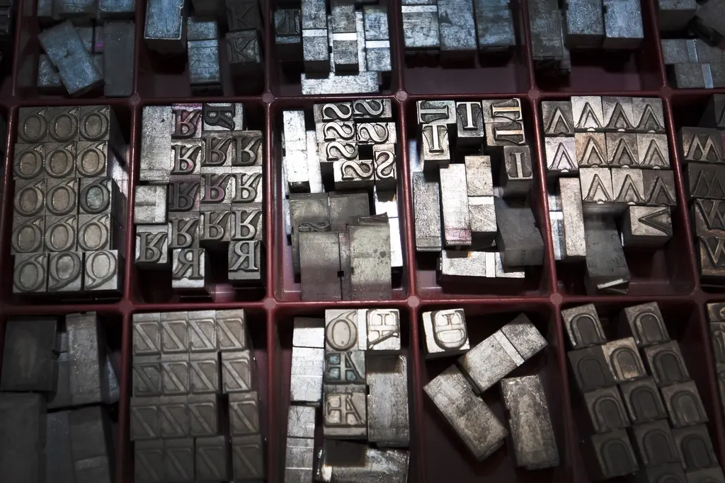
Typography: the voice you can see
Fonts do a surprising amount of work. Choosing them well, and sticking to them, is one of the quickest ways to look consistent.
- A headline typeface that carries personality
- A body typeface that’s easy to read at small sizes and on screens
- Fallbacks for when your fonts aren’t available, such as in Word documents shared with clients or in email
- A hierarchy: sizes and weights for headings, subheadings, body and captions
Two typefaces is plenty for most businesses. Five is a mess.
Imagery: the part most businesses leave to chance
Photos and illustrations often take up more space than anything else, and they’re the least controlled element in most small business brands. One page has sunny stock photos, the next has a blurry phone shot of the warehouse, and the social feed has something else entirely.
An imagery style sets out:
- What you photograph: real team, real work, real customers (with permission), or products
- How it looks: bright or moody, candid or posed, colour treatment, cropping
- What to avoid, like generic handshakes and people pointing at laptops
- Whether you use illustration or icons, and in what style
A single well-planned photoshoot can give you enough consistent images to cover a year of marketing.
Customers rarely remember your logo in detail. They remember an overall impression built from colour, type and pictures working together.
Supporting elements
Beyond the big three, most identities include a few smaller pieces that tie things together.
- Graphic devices: shapes, patterns, lines or a crop of the logo symbol that can be used as decoration
- Layout principles: margins, grids, where the logo sits, how much white space to leave
- Iconography: a consistent style for small icons on the website and in documents
- Templates: ready-made files for things you produce regularly, like proposals, social posts and presentations
Templates are the unglamorous hero here. They make it easy for people without design skills to produce something on-brand, which is the whole point.
How to tell if your brand identity is a system
Try this. Gather ten things your business has produced recently: website pages, a brochure, social posts, a quote, a sign. Lay them out together and cover up the logo on each one.
- Could someone tell they all came from the same business?
- Are the colours consistent, or are there several versions of “your” colour?
- How many different fonts can you count?
- Do the photos look like they belong together?
If the answer is mostly no, you have a logo, not a brand identity system.
Building one
You don’t necessarily need a new logo to fix this. Many businesses can keep their existing mark and build the rest of the system around it. Our brand identity work covers colour, type, imagery and templates as a joined-up set, and if you need photos that match, our photography team can shoot to the same style.